Email usinfo@buttercup.in

Rainbows are very fascinating, majestic, and intriguing. Due to its extravagant colour, it creates enough interest among human minds. Earlier, the rainbow was mostly related to the religious context, but its extravagantness and vivacious colours make it attractive to the artists. Nowadays, many graphic designers are incorporating rainbow colours into their designs to make them appealing and eye-catching.

But working with seven different colours is not at all a facile job. Because most of the designers usually restricted themselves to about three or fewer colours. So, this is a challenging job to incorporate all these seven colours in equal measure so that your design won’t look garish. In this article, we will explain how amazingly you can use rainbow colours in your graphic design to make it attractive and convincing. If you want to make your designs eye-catching and stunning by using rainbow colours, you should hire the best graphic designers for a reputed graphic design company in India to accomplish this job.
Let’s dig out some ways how to use rainbow in designs.
- Pair the rainbow with neutral hues: Neutral hues are white, black, beige, and grey. These colours represent all which are gloomy, humdrum, and ordinary. An efficient designer can use these colours to create balance and contrast to the intense vivacity of the rainbow colours. A designer can enhance this effect by using the vivacious colours of the rainbow within a largely dark design. This will certainly create magic and will make your design more attractive.
- Subtract some rainbow colours: A rainbow is a widely recognizable one. Even if you reduce its half of the colours, the viewers can easily connect with it and can understand that these fewer colours are actually representing the entire rainbow. Context and contrast are very helpful in this scenario. If you are using only three rainbow colours, make sure there are different. Always think the triadic colour scheme before selecting the colours.
- Separate the rainbow: It is true that the rainbow colours have a side-by-side appearance in nature, but a designer should use his or her creativity and aesthetic sense before using the colours. As a designer, you are free to separate and place them wherever you want to place them in your design. You can use this technique in character illustration or patterns. Some people may think that you are weakening the power of the rainbow. But think differently. By implementing this technique, you are sprinkling the rainbow all over your graphic design.
- Design a rainbow gradient: Do you want to keep the entire rainbow family together? Then, instead of deducing or subtracting each hue, you should blend all the colours together with a stylish gradient. A gradient certainly enhances its smooth and celestial appearance. It even depicts that the rainbow is a symbol of togetherness or unity. Thus, by blending colours together, you can highlight this metaphor.
- Make a rainbow ascent: You want to exhibit your design’s rainbow side, but at the same time, you don’t want to outshine other good qualities in the process. Then what will you do? In this context, you can use an accent and place rainbow subtly into some particular parts of your designs. This will add a show-stopping flair into your design while still gives a compliment to other elements.
- Give the rainbow a texture: If you want to create visual interest, then adding texture is the simplest way. This will also separate your rainbow from other vector designs on the market. A texture is responsible for creating shading and depth. You can use textures like paint strokes, smoke, mosaic tiles and 3D shading.
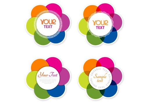
- Reshape the rainbows: Generally, rainbows are portrayed in either full or semi arcs or in horizontal bars. People are used to looking rainbow in these shapes. So, changing the shape is a great idea which will create enough interest and surprise in your design. You can use rainbow either in an open flower shape or you can choose a fully abstract form to make it more surprising and convincing.

- Repurpose the shape of the rainbows: Rainbow is a common word and when people hear this word, they automatically imagine some specific colours in arcs. To create a twist, you should discard all traditional colours and should focus on the rainbow’s arc. This gives an unpredictable look to your design.
- Be wild with rainbow colours: Rainbows’ boldness is the best feature which you need to use wisely. By setting off a rainbow bomb in your design, you can harness its power. This approach will work best where you don’t need a single element to stand out in your design. Now, you can use a rainbow with the full force in your design.
These are the top 9 ways to use rainbow in your design. Since rainbows are multi-coloured, so there are a plethora of ways by which you can interpret rainbow in your design.
Are you looking for a pre-eminent graphic design company in India who will help you in using rainbow in your design? You should get in touch with Buttercup because they have extensive experience in the field of graphic designing. With their skills, creativity, and adroitness, they will help you in making eye-catching and attractive designs.
By visiting their site, you will get to know some more information about them and their work.
Request Free Quote home
Fill up the form below, our team will get back soon
Let’s talk for new branding
Call us+91-99250 34404
Our location6th Floor, Karma Tower, Paldi, Ahmedabad - 380007
61 W 62nd st Apt25E NY,
NY 10023
6545 Simon avenue, Frisco
Texas 75035
27 Scammel Road, Winnipeg
MB, R2N 4P7. Canada.
5 Wesley Drive,Egham,
tw20 9ja